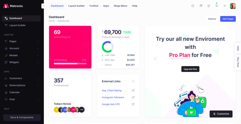
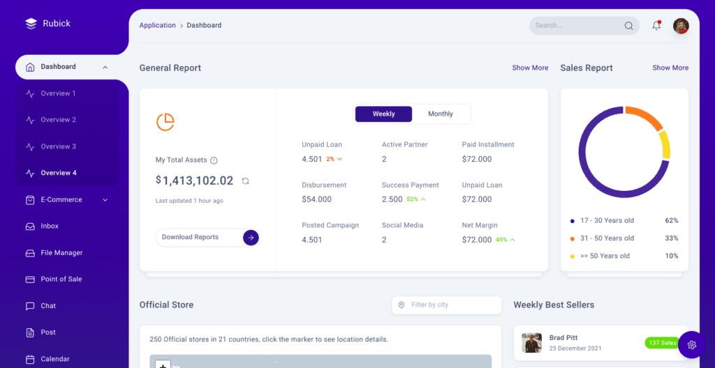
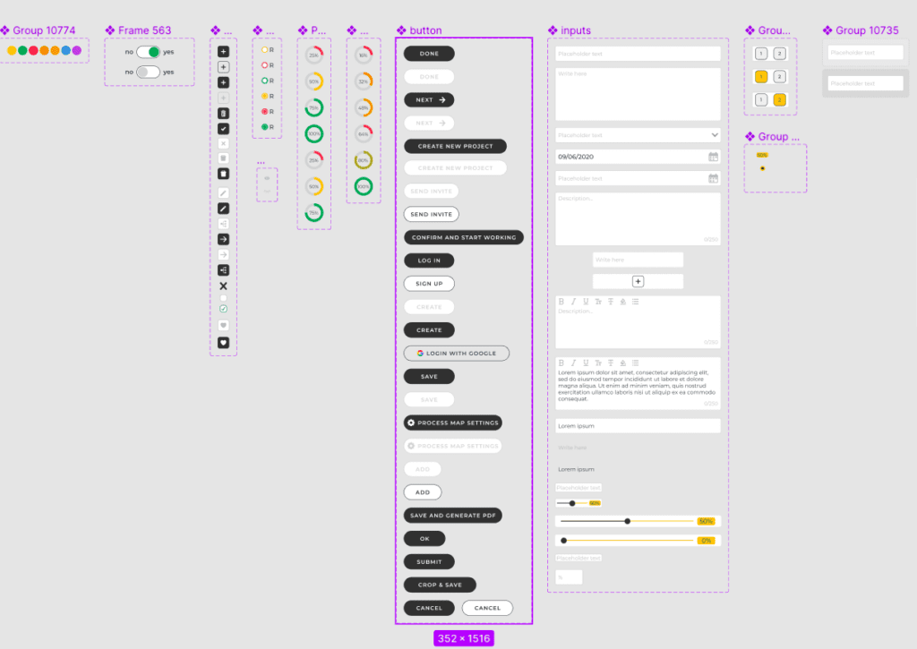
Today, when many industries are transferring online, websites play the role of companies’ business cards, tools to communicate with the audience, and platforms for ordering and providing services. If the site’s design is properly constructed, it can positively affect the implementation of the company’s business goals.
In this blog post, we will look at the basic principles of creating a web design and the principles of cooperation of a designer with a development team and clients. We’ll also mention the main criteria for successful web design and the main fashion trends observed in modern design development.
The Vital Role of Web Design in Today’s Online Landscape

The Role Of Web Design In Business
A well-thought-out design is a key element of a web solution because it directly affects the project’s success among users. The client may have a great business idea, pricing policy, and other well-written processes that work quickly and are responsive. Just because the design is poorly organized, in the first few seconds that people tend to give things, they won’t understand the interface and, accordingly, do not reach the same functions, because they may be illogically located.
In addition, the organization of the material in terms of hierarchy is important, and visual elements also play an important role here. This includes fonts, headings, blocks, and other visual elements that make it clear that, for example, one piece of information explains a more general concept that is presented higher on the page.
Web Design’s Influence On Marketing
Web design should, first of all, correspond to the general visual style of the brand. It is desirable that both the site and promotional materials (if they already exist), and the brand identity would also be maintained in the same style. These are the same fonts, color palette, and specific visual elements – the rest of the materials related to the brand should not stand out from each other and be in the same style.
Does Web Design Need To Have A Coding Knowledge?
Designers are a separate profession and don’t need to know how to code. The basic minimum required of them is an understanding of the development process at a very general level. This includes knowledge of how to write commands, how development works in general, some basic terms for these applications, and more. The designer needs this knowledge to communicate with the developer easily.
Web Design Successful Example
As for our design experience, here we can cite recent custom design experience.
We worked on a platform where users post their audio recordings, and other users listen to them. We have a very custom feature, like connected stories with several options for plot development.
Since the client did not provide any references and said that they hadn’t seen it anywhere, we developed the design ourselves. We needed to determine our requirements for this feature, the experience that needed to be modeled, what experience the user would ideally like to have, and how the user flow should go so that it was logical and convenient, intuitive, and consistent with the overall design of the entire application. And since we had no references, we had to do everything ourselves and use it to understand how optimized the user experience is. We develop a multi-step process for content creators and users who listen to it.
The most difficult moment was creating audio because there was the largest number of steps and interface elements that had to be done.
Tips for Crafting Harmonious Web Design

What If A Client Has No Web Design References?
One of the standard cases is when a client comes to us with nothing but an idea. In this case, we write the specification, with the consent of the customer. In the writing specification process, mockups are usually made – this is a black-and-white sketch of the future site pages. They determine the position of elements on all pages of the site. Mockups include exactly which elements will be, what they are responsible for, where you can click, and so on.
Then the specification with mockup and description are given to the designer. They examine the mockup, reading the specifications to understand the project. Because, if a designer doesn’t understand the project, it is unlikely they will be able to make a good design. Because the project direction significantly affects the color palette choice and appearance of the elements. And then, based on the mockups, the designer creates the design step by step. When creating the design itself, it does not change the location of the elements on the page but leaves them the same as in the mockup. An exception is the situation if the designer saw that from a UX point of view, the position of this or that element on the page can be better placed. In this case, the designer can offer his design’s versions, and a client approves it.
Other Non-Standard Cases
Another option is when the client doesn’t want a specification and doesn’t have mockups, but only a sketch of one website page, drawn with a pencil on paper. This case is more difficult for the designer because they spend more time creating a design and communicating and clarifying details with the PM and a client.
On the other hand, the designer feels more free and can design the site more creatively, according to their vision. This creative approach doesn’t always suit a client, especially if they want to redo something on one of the pages. And reworking a design is usually more expensive than reworking mockups because sketches are made quickly and inexpensively. If it takes about half an hour for us to create a mockup page, for example, then it takes two hours to develop the page design, and the designer’s work is usually paid hourly. However, if the client is sure they will not make any special changes, he can start directly with the design. If the client isn’t sure about the design, they should begin with a mockup.
Criteria That Drive Successful Web Projects
Mobile Adaptation in Web Design
The main site’s mobile version is an important component of the success of your design. Because, if the design is made for the desktop version, but works badly on smartphones and tablets, it can be unattractive and people can just hate to use it and they will go for something else that just looks better.
So, to make your design more responsive, one of the most important web design standards is called grid. It divides the page into columns. Depending on the types and number of elements, these columns can be larger or smaller in width. Each component must always be in a separate column.
Designers use site gridding to adapt the design for different gadgets, not just smartphones. For example, we have 4 columns on the page for a regular PC monitor. If you open this site on a tablet, two of these columns will slip down. This grid allows you to make a responsive design by moving the columns. If you open the same site on your phone, only one column remains at the top and the rest go down, one by one.

The Power of Intuitive Web Design
Also, the interface should be intuitive enough to immediately show the user what this or that option means and what result he should get with the help of small icons. Also, the sizes of the icons should show what is more important, general or more detailed. So a user doesn’t need to make additional efforts to find a needed element.
The size and location of the icons must correspond to the purpose of the site and its main task. A simple example: if you have a website where you can order accounting services, and it also has a blog, then the button for contacting and ordering a consultation should not be smaller than the button that leads to the blog. The blog was created for search optimization, and the site’s main purpose is to attract leads. Therefore, from the point of view of business logic, the design must also coordinate the user so that his attention is directed to the main moments from the point of view of a company.
Being Oriented at Other Cultures
This is the main criterion of web solution development designed for a certain audience, depending on the culture and language used. If the designer pays attention to this, it will ensure greater relevance and usability of your web solution, for example, for the East Asian or Arab audience for which the solution is initially developed.
Usually, for a Western audience, all sites are made in a way that the main things should be in an F-shaped pattern so that a person can look from left to right from top to bottom. For example, if these are sites of other cultures, then on the contrary, it is necessary to organize the most important elements to be located from right to left, because that is how people read them.
Stay Ahead with the Latest Trends in Website Creation

Clients often come to us with various requests and order a site design from us, which must correspond to the web solution functionality. But, if you analyze modern web designs, you can notice the brightest trends, which will be mentioned here.
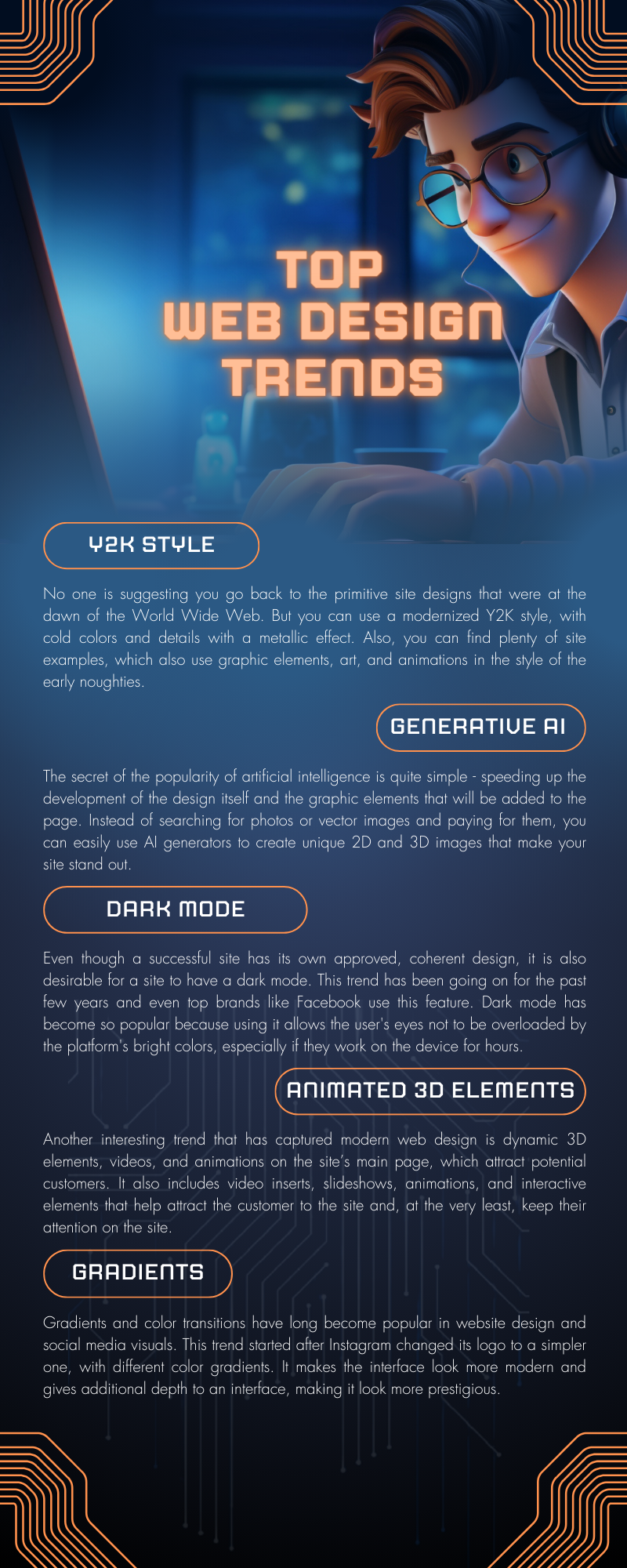
Y2K Aesthetics
As they usually say: “Everything new is a well-forgotten old thing.” If 5 years ago the 80s retro wave was in trend, now many spheres of activity – from street fashion to web design – are currently in the style of the late 90s – early 2000s.
Historical reference: Y2K, which stands for “the year 2000”, is a stylistic trend that embraces the aesthetics of the aforementioned years and highlights the concept of a “bright, technological future”. Some of the characteristic features of Y2K are the futuristic and cosmic designs of gadgets, innovative 3D special effects in movies and music videos at the time, and the predominance of cold metallic shades (sometimes – in combination with bright colors).
When it comes to modern web design, no one is suggesting you go back to the primitive site designs that were at the dawn of the World Wide Web. But you can use a modernized Y2K style, with cold colors and details with a metallic effect. Also, you can find a lot of examples on the network, which also uses graphic elements, art, and animations in the style of the early noughties.
Generative AI
Modern web design and the visual content creation are hard to imagine without AI generators like Midjourney, Playground, etc. The secret of the popularity of artificial intelligence is quite simple – speeding up the development of the design itself and the graphic elements that will be added to the page. Instead of searching for photos or vector images and paying for them, you can easily use AI generators to create unique 2D and 3D images that make your site stand out.
Gradients
Gradients and color transitions have long become popular both in website design and social media visuals. This trend started after Instagram changed its logo to a simpler one, with different color gradients. Since then, transitions between contrasting and adjacent colors have been actively used in interface designs of various web solutions.
The gradient makes the interface look more modern, gives additional depth to the interface, and makes it look more solid and prestigious.
Animated 3D Elements
Another interesting trend that has captured modern web design is dynamic 3D elements, videos, and animations on the site’s main page, which attract potential customers. It also includes video inserts, slideshows, animations, and interactive elements that help attract the customer to the site and, at the very least, keep their attention on the site.
In addition, three-dimensional elements, in combination with a gradient and contrasting colors, add depth, space, and realism to the site.
Dark Mode
Even though a successful site has its own approved, coherent design, it is also desirable for a site to have a dark mode. This trend has been going on for the past few years and even top brands like Facebook use this feature.
Dark mode has become so popular on the site because using it allows the user’s eyes not to be overloaded by the platform’s bright colors, especially if they work on the device for hours.
For a successful web design, you need to clearly understand what the design is for and for which area of activity this design is created. Web design development, although it does not require coding skills, it’s sophisticated and responsible work, that requires the development of an interface that would be modern, pleasing to the eye, and at the same time intuitive and such that it satisfies a client’s business needs.
Keeping up with modern trends in web design also plays an important role. If you pay attention to the latest website design trends, show your customers that you are relevant and can offer customers the latest and most interesting solutions. Expertise in one’s field is certainly important. But even the best company with the most experienced professionals and the highest quality service can simply remain unnoticed due to the lack of competent web design.


